Saturday, 26 September 2009

Roman, Part IIa - Writing Roman, basics

Roman letters convey a sense of order and balance. This perhaps has something to do with their strict proportions. Roman letters occupy either a square, a half square or 4/5's of a square.

I find it easiest to practice the proportions writing with a sharpie marker.Once you're confident that you've got your proportions right and your strokes going straight up and down. You might want to switch to a broad edged pen and practice Roman pen letters.

The normal pen angle is around 30 degress, a bit less that the 45 degrees used for Italic. Since dip pens cannot be pushed (only pulled), you will have to learn to draw the letters in a different stroke order. The round letters such as O, C, G and Q are drawn in 2 strokes starting from the thinnest point of the letter (11 o'clock). The letter U is also done in 2 strokes, again meeting at the thinnest point (4 o'clock) coming down from the top. The letter S is done in 3 strokes.

You might want to increase the pen angle to 45 degrees for M's and N's and decrease it to 0 for the diagonal stroke of the letter Z to give it more weight. Note also that the letter M looks better when made a bit narrower than a W
Some faults. The letters C and G are slanted to the right. The top lobe of the letter B is larger than the bottom lobe. If anything, the bottom lobe should be equal in size or slightly bigger than the top such that the letter does not look top heavy. The lobes of the letters D, B, P and R should look like a train tunnel turned on its side, i.e. coming out straight and then curving down rather than a semicircle. The lobe of the P is a nice example while the lower lobe of the B is not.

Just to get ahead of myself a bit, I have included two variations on the last line which correspond to a W and two O's. The thickest part of the one O should intersect with the thinnest part of the other (easier said than done). These are used to improve spacing when needed. More on that in the article on spacing.

Sunday, 20 September 2009

Roman, Part I - History and the evolution of the serif

The modern European letters have their roots in Roman and Greek. The Greeks did not seems to have shared the Roman passion for carving writing in stone; and how fortunate that the Romans did. It seems hard to imagine that we were that close to writing Uncial and Gothic instead of Roman, but the revival of Roman letters only came when Ren
aissance scholars found Roman letters carved in relics.

Romans never actually wrote in the letters that we now call Roman. Manuscripts suggest that they had an everyday script which was written with a broad edge pen (most likely to be a reed pen of sorts). Thus it was a sans serif script in the beginning. The modern serifed Roman was an engravers script which cannot be "written" properly without undue exertion, in fact serifed letters were only found in carvings. The rationale for the creation of the serif, or rather it's postulated evolutionary steps from the pen written daily script, had been outlined by Wotzkow in the book "The Art of Hand Lettering". Here I borrow the reasoning and the illustrations from the book.

Wotzkow argues that incised Roman letter might well have started out as a copy of pen letters, i.e.
But it was difficult to obtain good optical spacing with slanted endings, thus the masons decided to flatten the legs of the letters and made them horizontal, like this:This created a technical problem as it was hard to get sharp corners with straight edges when carving stone, thus and extra cut was added to sharpen the corner. This meant that corners would become wider than the stroke. That had the extra advantage in that it looked really good, so masons enlarged it beyond the necessary proportions and it became the serif as we know today.

Saturday, 19 September 2009

Calligraphy terms

This short post will introduce some terms used in calligraphy.

Broad edged pen
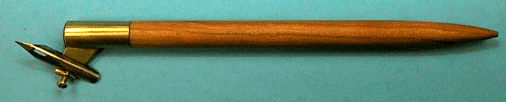
The common calligraphy pen with a flat edge. Can be a dip pen, fountain pen, chisel point marker, reed pen, etc. In fact anything with a straight edge including cut popsicle sticks, pieces of carboard, etc. can be used to write. Roman, uncial and italic are written using broad edge pens.

Broad edge pens are classified by nib width and different angle cut into the nib, which include normal, left hand oblique and right hand oblique. A common misconception is that left-handed people should use left hand oblique nibs when in fact left and right denote only the direction of the slanting of the nib's edge with respect to the barrel of the pen. Richard Binder's site has excellent information on this subject (http://www.richardspens.com/?page=ref/nib_primer.htm).

Pen angle
The angle that the edge of the nib makes with the horizontal as shown as measured in a counter-clockwise direction. Pen angles differ from script to script. Some common ones are listed below:
  • Uncial: less than 20 degrees
  • Roman: 30 degrees
  • Italic: 45 degrees
  • Cursive: -70 degrees (more on that later)

(image source: www.calligraphylearn.com)

Majuscule
The formal name for capital letters.

Minuscule
The lower case letters. Legend has it that typesetters put the more frequently used small letters in the lower case and less used capitals in the upper case, hence the name.

x height
The height of the small letter x. Usually the x height is given as the number of nib widths.

Slant
Slant is the angle at which the letter itself makes with the vertical measured in a clockwise direction. Roman and uncial script is written without slant, i.e. verticals go straight up and down. Italics are done with a moderate 5-20 degree slant. Cursive is usually has a slant of more than 30 degrees.

Flex/ flex nibs
Perhaps the least well-defined aspects of nibs. Flexible nibs produce a broader line upon increasing pressure. A nib is flexy if the ratio of pressure vs line width is small. The scale used to describe the flexiness of a nib is "rigid", "semi-rigid", "semi-flex", "flex", "full flex" and "wet noodle". Some nibs are soft or springy, meaning that the nib deforms upon pressure but the line does not broaden too significantly. The best flex nibs are able to go from needlepoint (~0.2mm) to double broad (2mm). Flex nibs are hard to use and easy to break. Fountain pens used to be semi-flex but most modern ones are made to be rigid, soft at best.

Flex nibs are used to write cursive such as Copperplate and Spencerian.

Oblique holder
Nib holder used for holding flexible nibs to achieve the -70 pen angle. Some left-handed calligraphers may be able to write cursive without using this tool.


Thursday, 17 September 2009

Calligraphy

Calligraphy means beautiful writing and has its roots in the days which books were manually copied where the handwriting of the scribe mattered. In this age of computer lettering, the importance of hand lettering has been elevated and belittled at the same time, meaning that it has become unnecessary as art is.

This series will talk about western calligraphy as differentiated from Chinese calligraphy and Arabic calligraphy, together they are the 3 forms of calligraphy that are most widely practiced today.

The latin characters that are used in Europe and America have their roots in Greek and Roman (Latin). While the Greeks might not have been the first Western civilization to write, it is there script that has passed on to form the letters that we know today. Script, which is the font in which a piece of calligraphy is done since font is used in typography not calligraphy, is mainly divided into 2 types, cursive and print. The most practiced types of print are Roman, Uncial, Gothic and Italic; while roundhand, copperplate and Spencerian [and its many copycat-scripts] rank high among the most popular cursive scripts.

I will introduce each type of script starting with its history and development, followed by some examples and some pointers on how you can practice and write that script. I will hand letter all the examples in this series.

Calligraphy should be treated as an art, and the best works are definitely pieces of art. Calligraphy is not turning yourself into a type writer and putting perfect letter after perfect letter, it is about creating something beautiful using the shapes that people recognize as letters.

Monday, 13 July 2009

Technical Details

I am obviously not the most eloquent person when it comes to explaining advanced theories of lens design. Therefore, here are a few links to some of the cyberspace gurus.

Paul van Walree. All about aberations and causes of optical flaws: http://toothwalker.org/optics.html

Erwin Puts. Lots of information on lens design and how to read MTF charts: http://www.imx.nl/photo/index.html

Saturday, 4 July 2009

Colour Balance

I have been told not to meddle with the creative process. That is why I have steered clear of the topic of composition till now, but there is one topic that I believe requires special attention, and it is the topic of this post, colour balance. There are no rules in art. If you worry that looking at this post will limit your creativity, skip it now.

Colour balnce is simply how most people think colours go together. That is probably why the rules of colour balance are often obeyed in flags. After all, you do want your flag to be pleasing to the eye, right? Most people have an idea of which colours to include in a picture, e.g. the use of contrasting colours, etc. The concept of colour balance is how much of each colour should be present. Consider the red-yellow-blue colour wheel, the general rule is that adjacent primary colours (red-yellow, yellow-blue, blue-red) balance each other in 1:1 or 1:3.

Colours opposite each other (red-green, yellow-purple, blue-orange) balance in bits, i.e. less than 1:3.

This is only a general rule and many other pleasing combinations exist. Furthermore, the balance changes as the tones change, i.e. pleasing proportions of red to green might not be pleasing for pink and olive. Treat this as a starting point for arranging colours in your art if you find yourself out of inspiration, but always endeavour to find something new and exciting. Remember, your eye is the final judge.

Thursday, 11 June 2009

Bokeh and DOF, part 1

Background blur, out of focus areas, lens blur, bokeh, whatever you choose to call it. It's the areas in the photo that are not in the plane of sharp focus. Because most of our pictures are of three dimensional objects, bokeh exists in every picture. Background blur helps convey a sense of three dimensionality from a flat picture. Sometimes it is nice to blur out distracting backgrounds, this technique is especially common for portrait shots.

So how does bokeh occur and what governs the blurriness of the bokeh? What is good/bad bokeh? For that, it's time to review your high school optics.

WARNING: Lots of ray diagrams ahead. Skip to "Bluriness and Depth of Field" if needed.

Whenever the film/sensor is not at the point of sharp focus, the rays that reach the film exist as a patch in the shape of the aperture (triangular in this diagram, hexagonal or round for most lenses) and it is these patches of light that make up the bokeh. Convince yourself that the larger the patch of light, the more defocused the image is. Once you've done that, it's time to talk about the 3 factors that affect the bluriness of bokeh, i.e. focal length, aperture and subject-background distance.

Effect of Focal length
The longer the focal length, the more blurry out-of-focus (OOF) objects become (given that the other two factors are kept the same).
Here we have two lenses, one of focal length 30mm and the other 80mm. The 80mm lens has more background blur than the 30mm lens. If we treat the red object (object giving out red rays) as the subject of interest, we would move the lens to place the image of the red object at the film plane. The bokeh of the green object is given by the unfocused green light that reaches the film plane (where the image of the red object is). It is seen that d2 is larger than d1. In other words, the unfocused light from the green object is more unfocused when it gets to the film plane. So the image of the green object is blurier when the 80mm lens is used.

Effect of Aperture
The larger the aperture, the more OOF objects become.
Using our hypothetical 80mm lens, we take a photo at full aperture, again focused at the red object. The spread of the green rays is then d3. If we stop down, the light that reaches the lens becomes "straighter" (closer to the centre). The effect is that the spread of the exiting rays is decreased (d4 Vs d3) and the green object appears less blurry. Taken to an extreme case, if we do away with the lens and use a pinhole, then everything would be equally sharp in the picture regardless of object distance.

Effects of Object Distance
This is perhaps the most puzzling part of OOF objects. Intuitive enough is the fact that the greater the seperation between the object and the background the more blurry the background. What is puzzling is that given the same distance between the subject and the background, the background is more blurred if the subject is closer to the lens.Given 3 objects (red, green and blue) equidistant from each other, their images after passing through our hypothetical 80mm lens are as shown above.

The first point that the further away the object the more blurred it becomes can be seen by comparing the spread of the green and blue rays at the plane of the red image. The spread of the further away object (blue) is much greater than the closer object (green). Intuitive. The further away from the point that the lens is focused at (i.e. the red object), the more defocused you are.

The second part that even if the objects are separated equally, the closer pair will yield a more blurred background can be illustrated by comparing d1 and d2. If we focus the lens on the green object, the spread of the blue rays in the image is d1. When we focus on the red object instead, the spread of the green rays is d2 which is larger than d1. This means that although the distance between red and green and green and blue are the same, because red and green are closer to the lens, green is more blurred. If we think of it in another way, this too becomes intuitive. Consider two people one 3m in front of the other. If you were 1 meter away, they would be 1 and 4m away from you, a 400% difference. If you were 1km away, they would be 1000 and 1004m away, which is just a 0.4% difference. Now it is intuitive that two objects differing by 0.4% yield similar images while objects differing by 400% should give vastly different images.


Bluriness and Depth of Field

In an ideal world with film of infinite resolution where we can view images with infinite magnification, the plane of sharp focus has no thickness and only objects at a specific distance, e.g. 3m and not 3.0000001m, will be in focus. In this world however, we do not view images with infinite magnificantion, even if we did, we would hit the resolution limit of the film/sensor where slightly out of focus and sharply focused images cannot be distinguished. Depth of field (DOF) is simply how much bluriness can "fly under the radar". If we cannot percieve it as blurred, it is sharp.

A large DOF means that the transition from sharp to perceptible bluriness is over a large object distance. Most, if not all, parts of the image are perceived as sharp. A shallow DOF is the opposite, the transition from sharp to blurred occurs over a short distance, only objects close to the plane of sharp focus are perceived as sharp.

The trick to shallow DOF? Use a long lens, use a larger aperture, get close to the subject and choose a background that is far away.