- Don't try to write the same letter over and over. It's tempting but instead of improving, you will remember you mistakes.
- Practice letters in groups. Letters with similar strokes or proportions should be practiced in groups.
- Once it's on the paper, it's too late anyway. Fill a page and then go back and look at it, think about it and try to do better the next time. It's more important to get the feel of writing (esp. when practicing with the pen) than to stop after every letter and worry about whether its perfect.
- Don't over-do it. There's only that many sheets you can fill before you feel tired, physically and mentally. Stop, relax and come back tomorrow.
Wednesday 30 September 2009
How to practice.
Some suggestions for practicing calligraphy.
Italic, Part II - The minuscules
Because metal broad edge pens cannot be pushed, the strokes must differ from the accepted stroke order of the English alphabet. Strokes are often broken into two part to allow pulling of the pen. Strokes directions are indicated in the diagram below with red arrows, the red lines indicate where a stroke starts when there is ambiguity. The number of arrows correspond to the number of strokes.
The basic strokes of Italic are the straight curve and the rounded point. (This is full of Zen.) The straight curve starts at 45 degrees and flattens out toward the top. The rounded point is the other part of the straight curve which starts out at 45 degrees and goes down and up. The rounded point can also be written upside down as is in the letters b, p, h, m n and k.
For starters, ascenders and descenders both have the same height as the x height. Although this is often changed to suit the mood of each piece.
 The slant (indicated by the dotted lines) should be consistent throughout the whole piece. For letters with straight portions the slant is easy to determine. For letters without straight lines running along the slant, the slant is the optical bisector of the letter (e.g. o, x, v ,w) or the bounding box of the letter (e.g. z, e, c, s). Although the proportions of the letters are not as strict as in Roman, Italic minuscules should occupy a parallelogram that has a width smaller than the height and that parallelogram should be of the same size throughout a piece.
Notice that q's should look like turned over b's and n's like upside down u's. Try to make them as similar to each other as possible. Consistency is more important than form. Two consecutive letters (e.g. those two t's in "letters") really do have to look the same to "make it work".
Italic, Part I - History
Before the invention of printing, manuscripts had to be copied by scribes. Italic was the result of lazy scribes but then replaced the unwieldy Uncial. The name results from the country which most books were written, and hence had the most book writing scribes, at the time. The word Italic should be pronounced "It-tal-lic" in honour of its origins and not "I-tal-lic" as it is sometimes heard. Italic is not a single kind of script. Any script that has a slant angle and is written with a broad edge pen can be considered Italic. This series will use the most clearly formed type of Italic, Chancery Italic, as an example to illustrate the basic construction of Italic letters.
A script to meet the needs
Italic was a result of the Renaissance. Before that, the only thing that needed to be written belonged to the church and there was no great rush to publish many copies. Hence booked were decorated (illuminated) with drawings and gilded. The speed at which the script could be written was of no great importance. It was probably during the renaissance that the word "sold out" was first related to books. Suddenly, being able to write fast was a useful skill. At that time, the official "book hand" (script used to write books) was Uncial, which was slow to write since it required multiple strokes for each letter. Scribes started seeking "short hand versions" of the letters which meant that they would write each letter with one stroke. Writing with quills, they were able to push their pens; something that modern calligraphers with crisp Italic nibs cannot, which explains why we need more than one stroke for most Italic letters nowadays. The writing slant was also a result of speeding up since the natural movement of the (right) hand is from bottom left to top right.
Evolution under constraints of the tool
The flag top (i.e. upward motion before verticals in letters d, b, p, h, m, etc.) and the ligature (i.e. the final upward stroke of the letters a, d, h ,m, n, etc.) was part a solution to a technical problem and a result of speedy writing. Quills don't always start on the first touch or they may put down too much ink at the first touch (which incidentally is sometimes a problem with dip pens too), the flag top allowed the ink flow to become consistent before writing the letter, it was also allowed the writer to have a second chance on the letter spacing - imagine starting straight down and finding that the letters were too close together. The ligature was most probably the result of lifting the pen too slowly when moving to the next letter. In Chancery Italic the letters are not linked, but Italic in which letters are linked (cursive Italic) do exist.
Saturday 26 September 2009
Roman, Part IIa - Writing Roman, basics
Roman letters convey a sense of order and balance. This perhaps has something to do with their strict proportions. Roman letters occupy either a square, a half square or 4/5's of a square.
I find it easiest to practice the proportions writing with a sharpie marker. Once you're confident that you've got your proportions right and your strokes going straight up and down. You might want to switch to a broad edged pen and practice Roman pen letters.
The normal pen angle is around 30 degress, a bit less that the 45 degrees used for Italic. Since dip pens cannot be pushed (only pulled), you will have to learn to draw the letters in a different stroke order. The round letters such as O, C, G and Q are drawn in 2 strokes starting from the thinnest point of the letter (11 o'clock). The letter U is also done in 2 strokes, again meeting at the thinnest point (4 o'clock) coming down from the top. The letter S is done in 3 strokes.
You might want to increase the pen angle to 45 degrees for M's and N's and decrease it to 0 for the diagonal stroke of the letter Z to give it more weight. Note also that the letter M looks better when made a bit narrower than a W
 Some faults. The letters C and G are slanted to the right. The top lobe of the letter B is larger than the bottom lobe. If anything, the bottom lobe should be equal in size or slightly bigger than the top such that the letter does not look top heavy. The lobes of the letters D, B, P and R should look like a train tunnel turned on its side, i.e. coming out straight and then curving down rather than a semicircle. The lobe of the P is a nice example while the lower lobe of the B is not.
Just to get ahead of myself a bit, I have included two variations on the last line which correspond to a W and two O's. The thickest part of the one O should intersect with the thinnest part of the other (easier said than done). These are used to improve spacing when needed. More on that in the article on spacing.
I find it easiest to practice the proportions writing with a sharpie marker.
 Once you're confident that you've got your proportions right and your strokes going straight up and down. You might want to switch to a broad edged pen and practice Roman pen letters.
The normal pen angle is around 30 degress, a bit less that the 45 degrees used for Italic. Since dip pens cannot be pushed (only pulled), you will have to learn to draw the letters in a different stroke order. The round letters such as O, C, G and Q are drawn in 2 strokes starting from the thinnest point of the letter (11 o'clock). The letter U is also done in 2 strokes, again meeting at the thinnest point (4 o'clock) coming down from the top. The letter S is done in 3 strokes.
You might want to increase the pen angle to 45 degrees for M's and N's and decrease it to 0 for the diagonal stroke of the letter Z to give it more weight. Note also that the letter M looks better when made a bit narrower than a W
 Some faults. The letters C and G are slanted to the right. The top lobe of the letter B is larger than the bottom lobe. If anything, the bottom lobe should be equal in size or slightly bigger than the top such that the letter does not look top heavy. The lobes of the letters D, B, P and R should look like a train tunnel turned on its side, i.e. coming out straight and then curving down rather than a semicircle. The lobe of the P is a nice example while the lower lobe of the B is not.
Just to get ahead of myself a bit, I have included two variations on the last line which correspond to a W and two O's. The thickest part of the one O should intersect with the thinnest part of the other (easier said than done). These are used to improve spacing when needed. More on that in the article on spacing.
Sunday 20 September 2009
Roman, Part I - History and the evolution of the serif
The modern European letters have their roots in Roman and Greek. The Greeks did not seems to have shared the Roman passion for carving writing in stone; and how fortunate that the Romans did. It seems hard to imagine that we were that close to writing Uncial and Gothic instead of Roman, but the revival of Roman letters only came when Ren
aissance scholars found Roman letters carved in relics.
Romans never actually wrote in the letters that we now call Roman. Manuscripts suggest that they had an everyday script which was written with a broad edge pen (most likely to be a reed pen of sorts). Thus it was a sans serif script in the beginning. The modern serifed Roman was an engravers script which cannot be "written" properly without undue exertion, in fact serifed letters were only found in carvings. The rationale for the creation of the serif, or rather it's postulated evolutionary steps from the pen written daily script, had been outlined by Wotzkow in the book "The Art of Hand Lettering". Here I borrow the reasoning and the illustrations from the book.
Wotzkow argues that incised Roman letter might well have started out as a copy of pen letters, i.e.
 But it was difficult to obtain good optical spacing with slanted endings, thus the masons decided to flatten the legs of the letters and made them horizontal, like this:
 This created a technical problem as it was hard to get sharp corners with straight edges when carving stone, thus and extra cut was added to sharpen the corner. This meant that corners would become wider than the stroke. That had the extra advantage in that it looked really good, so masons enlarged it beyond the necessary proportions and it became the serif as we know today.

Saturday 19 September 2009
Calligraphy terms
This short post will introduce some terms used in calligraphy.
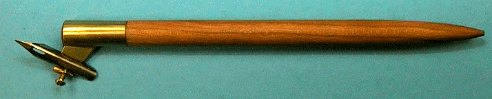
Broad edged pen
The common calligraphy pen with a flat edge. Can be a dip pen, fountain pen, chisel point marker, reed pen, etc. In fact anything with a straight edge including cut popsicle sticks, pieces of carboard, etc. can be used to write. Roman, uncial and italic are written using broad edge pens.
Broad edge pens are classified by nib width and different angle cut into the nib, which include normal, left hand oblique and right hand oblique. A common misconception is that left-handed people should use left hand oblique nibs when in fact left and right denote only the direction of the slanting of the nib's edge with respect to the barrel of the pen. Richard Binder's site has excellent information on this subject (http://www.richardspens.com/?page=ref/nib_primer.htm).
Pen angle
The angle that the edge of the nib makes with the horizontal as shown as measured in a counter-clockwise direction. Pen angles differ from script to script. Some common ones are listed below:
 (image source: www.calligraphylearn.com)
Majuscule
The formal name for capital letters.
Minuscule
The lower case letters. Legend has it that typesetters put the more frequently used small letters in the lower case and less used capitals in the upper case, hence the name.
x height
The height of the small letter x. Usually the x height is given as the number of nib widths.
Slant
Slant is the angle at which the letter itself makes with the vertical measured in a clockwise direction. Roman and uncial script is written without slant, i.e. verticals go straight up and down. Italics are done with a moderate 5-20 degree slant. Cursive is usually has a slant of more than 30 degrees.
Flex/ flex nibs
Perhaps the least well-defined aspects of nibs. Flexible nibs produce a broader line upon increasing pressure. A nib is flexy if the ratio of pressure vs line width is small. The scale used to describe the flexiness of a nib is "rigid", "semi-rigid", "semi-flex", "flex", "full flex" and "wet noodle". Some nibs are soft or springy, meaning that the nib deforms upon pressure but the line does not broaden too significantly. The best flex nibs are able to go from needlepoint (~0.2mm) to double broad (2mm). Flex nibs are hard to use and easy to break. Fountain pens used to be semi-flex but most modern ones are made to be rigid, soft at best.
Flex nibs are used to write cursive such as Copperplate and Spencerian.
Oblique holder
Nib holder used for holding flexible nibs to achieve the -70 pen angle. Some left-handed calligraphers may be able to write cursive without using this tool.
Broad edged pen
The common calligraphy pen with a flat edge. Can be a dip pen, fountain pen, chisel point marker, reed pen, etc. In fact anything with a straight edge including cut popsicle sticks, pieces of carboard, etc. can be used to write. Roman, uncial and italic are written using broad edge pens.
Broad edge pens are classified by nib width and different angle cut into the nib, which include normal, left hand oblique and right hand oblique. A common misconception is that left-handed people should use left hand oblique nibs when in fact left and right denote only the direction of the slanting of the nib's edge with respect to the barrel of the pen. Richard Binder's site has excellent information on this subject (http://www.richardspens.com/?page=ref/nib_primer.htm).
Pen angle
The angle that the edge of the nib makes with the horizontal as shown as measured in a counter-clockwise direction. Pen angles differ from script to script. Some common ones are listed below:
- Uncial: less than 20 degrees
- Roman: 30 degrees
- Italic: 45 degrees
- Cursive: -70 degrees (more on that later)
(image source: www.calligraphylearn.com)Majuscule
The formal name for capital letters.
Minuscule
The lower case letters. Legend has it that typesetters put the more frequently used small letters in the lower case and less used capitals in the upper case, hence the name.
x height
The height of the small letter x. Usually the x height is given as the number of nib widths.
Slant
Slant is the angle at which the letter itself makes with the vertical measured in a clockwise direction. Roman and uncial script is written without slant, i.e. verticals go straight up and down. Italics are done with a moderate 5-20 degree slant. Cursive is usually has a slant of more than 30 degrees.
Flex/ flex nibs
Perhaps the least well-defined aspects of nibs. Flexible nibs produce a broader line upon increasing pressure. A nib is flexy if the ratio of pressure vs line width is small. The scale used to describe the flexiness of a nib is "rigid", "semi-rigid", "semi-flex", "flex", "full flex" and "wet noodle". Some nibs are soft or springy, meaning that the nib deforms upon pressure but the line does not broaden too significantly. The best flex nibs are able to go from needlepoint (~0.2mm) to double broad (2mm). Flex nibs are hard to use and easy to break. Fountain pens used to be semi-flex but most modern ones are made to be rigid, soft at best.
Flex nibs are used to write cursive such as Copperplate and Spencerian.
Oblique holder
Nib holder used for holding flexible nibs to achieve the -70 pen angle. Some left-handed calligraphers may be able to write cursive without using this tool.
Thursday 17 September 2009
Calligraphy
Calligraphy means beautiful writing and has its roots in the days which books were manually copied where the handwriting of the scribe mattered. In this age of computer lettering, the importance of hand lettering has been elevated and belittled at the same time, meaning that it has become unnecessary as art is.
This series will talk about western calligraphy as differentiated from Chinese calligraphy and Arabic calligraphy, together they are the 3 forms of calligraphy that are most widely practiced today.
The latin characters that are used in Europe and America have their roots in Greek and Roman (Latin). While the Greeks might not have been the first Western civilization to write, it is there script that has passed on to form the letters that we know today. Script, which is the font in which a piece of calligraphy is done since font is used in typography not calligraphy, is mainly divided into 2 types, cursive and print. The most practiced types of print are Roman, Uncial, Gothic and Italic; while roundhand, copperplate and Spencerian [and its many copycat-scripts] rank high among the most popular cursive scripts.
I will introduce each type of script starting with its history and development, followed by some examples and some pointers on how you can practice and write that script. I will hand letter all the examples in this series.
Calligraphy should be treated as an art, and the best works are definitely pieces of art. Calligraphy is not turning yourself into a type writer and putting perfect letter after perfect letter, it is about creating something beautiful using the shapes that people recognize as letters.
Subscribe to:
Posts (Atom)