- Don't try to write the same letter over and over. It's tempting but instead of improving, you will remember you mistakes.
- Practice letters in groups. Letters with similar strokes or proportions should be practiced in groups.
- Once it's on the paper, it's too late anyway. Fill a page and then go back and look at it, think about it and try to do better the next time. It's more important to get the feel of writing (esp. when practicing with the pen) than to stop after every letter and worry about whether its perfect.
- Don't over-do it. There's only that many sheets you can fill before you feel tired, physically and mentally. Stop, relax and come back tomorrow.
Wednesday, 30 September 2009
How to practice.
Some suggestions for practicing calligraphy.
Italic, Part II - The minuscules
Because metal broad edge pens cannot be pushed, the strokes must differ from the accepted stroke order of the English alphabet. Strokes are often broken into two part to allow pulling of the pen. Strokes directions are indicated in the diagram below with red arrows, the red lines indicate where a stroke starts when there is ambiguity. The number of arrows correspond to the number of strokes.
The basic strokes of Italic are the straight curve and the rounded point. (This is full of Zen.) The straight curve starts at 45 degrees and flattens out toward the top. The rounded point is the other part of the straight curve which starts out at 45 degrees and goes down and up. The rounded point can also be written upside down as is in the letters b, p, h, m n and k.
For starters, ascenders and descenders both have the same height as the x height. Although this is often changed to suit the mood of each piece.
 The slant (indicated by the dotted lines) should be consistent throughout the whole piece. For letters with straight portions the slant is easy to determine. For letters without straight lines running along the slant, the slant is the optical bisector of the letter (e.g. o, x, v ,w) or the bounding box of the letter (e.g. z, e, c, s). Although the proportions of the letters are not as strict as in Roman, Italic minuscules should occupy a parallelogram that has a width smaller than the height and that parallelogram should be of the same size throughout a piece.
Notice that q's should look like turned over b's and n's like upside down u's. Try to make them as similar to each other as possible. Consistency is more important than form. Two consecutive letters (e.g. those two t's in "letters") really do have to look the same to "make it work".
Italic, Part I - History
Before the invention of printing, manuscripts had to be copied by scribes. Italic was the result of lazy scribes but then replaced the unwieldy Uncial. The name results from the country which most books were written, and hence had the most book writing scribes, at the time. The word Italic should be pronounced "It-tal-lic" in honour of its origins and not "I-tal-lic" as it is sometimes heard. Italic is not a single kind of script. Any script that has a slant angle and is written with a broad edge pen can be considered Italic. This series will use the most clearly formed type of Italic, Chancery Italic, as an example to illustrate the basic construction of Italic letters.
A script to meet the needs
Italic was a result of the Renaissance. Before that, the only thing that needed to be written belonged to the church and there was no great rush to publish many copies. Hence booked were decorated (illuminated) with drawings and gilded. The speed at which the script could be written was of no great importance. It was probably during the renaissance that the word "sold out" was first related to books. Suddenly, being able to write fast was a useful skill. At that time, the official "book hand" (script used to write books) was Uncial, which was slow to write since it required multiple strokes for each letter. Scribes started seeking "short hand versions" of the letters which meant that they would write each letter with one stroke. Writing with quills, they were able to push their pens; something that modern calligraphers with crisp Italic nibs cannot, which explains why we need more than one stroke for most Italic letters nowadays. The writing slant was also a result of speeding up since the natural movement of the (right) hand is from bottom left to top right.
Evolution under constraints of the tool
The flag top (i.e. upward motion before verticals in letters d, b, p, h, m, etc.) and the ligature (i.e. the final upward stroke of the letters a, d, h ,m, n, etc.) was part a solution to a technical problem and a result of speedy writing. Quills don't always start on the first touch or they may put down too much ink at the first touch (which incidentally is sometimes a problem with dip pens too), the flag top allowed the ink flow to become consistent before writing the letter, it was also allowed the writer to have a second chance on the letter spacing - imagine starting straight down and finding that the letters were too close together. The ligature was most probably the result of lifting the pen too slowly when moving to the next letter. In Chancery Italic the letters are not linked, but Italic in which letters are linked (cursive Italic) do exist.
Saturday, 26 September 2009
Roman, Part IIa - Writing Roman, basics
Roman letters convey a sense of order and balance. This perhaps has something to do with their strict proportions. Roman letters occupy either a square, a half square or 4/5's of a square.
I find it easiest to practice the proportions writing with a sharpie marker. Once you're confident that you've got your proportions right and your strokes going straight up and down. You might want to switch to a broad edged pen and practice Roman pen letters.
The normal pen angle is around 30 degress, a bit less that the 45 degrees used for Italic. Since dip pens cannot be pushed (only pulled), you will have to learn to draw the letters in a different stroke order. The round letters such as O, C, G and Q are drawn in 2 strokes starting from the thinnest point of the letter (11 o'clock). The letter U is also done in 2 strokes, again meeting at the thinnest point (4 o'clock) coming down from the top. The letter S is done in 3 strokes.
You might want to increase the pen angle to 45 degrees for M's and N's and decrease it to 0 for the diagonal stroke of the letter Z to give it more weight. Note also that the letter M looks better when made a bit narrower than a W
 Some faults. The letters C and G are slanted to the right. The top lobe of the letter B is larger than the bottom lobe. If anything, the bottom lobe should be equal in size or slightly bigger than the top such that the letter does not look top heavy. The lobes of the letters D, B, P and R should look like a train tunnel turned on its side, i.e. coming out straight and then curving down rather than a semicircle. The lobe of the P is a nice example while the lower lobe of the B is not.
Just to get ahead of myself a bit, I have included two variations on the last line which correspond to a W and two O's. The thickest part of the one O should intersect with the thinnest part of the other (easier said than done). These are used to improve spacing when needed. More on that in the article on spacing.
I find it easiest to practice the proportions writing with a sharpie marker.
 Once you're confident that you've got your proportions right and your strokes going straight up and down. You might want to switch to a broad edged pen and practice Roman pen letters.
The normal pen angle is around 30 degress, a bit less that the 45 degrees used for Italic. Since dip pens cannot be pushed (only pulled), you will have to learn to draw the letters in a different stroke order. The round letters such as O, C, G and Q are drawn in 2 strokes starting from the thinnest point of the letter (11 o'clock). The letter U is also done in 2 strokes, again meeting at the thinnest point (4 o'clock) coming down from the top. The letter S is done in 3 strokes.
You might want to increase the pen angle to 45 degrees for M's and N's and decrease it to 0 for the diagonal stroke of the letter Z to give it more weight. Note also that the letter M looks better when made a bit narrower than a W
 Some faults. The letters C and G are slanted to the right. The top lobe of the letter B is larger than the bottom lobe. If anything, the bottom lobe should be equal in size or slightly bigger than the top such that the letter does not look top heavy. The lobes of the letters D, B, P and R should look like a train tunnel turned on its side, i.e. coming out straight and then curving down rather than a semicircle. The lobe of the P is a nice example while the lower lobe of the B is not.
Just to get ahead of myself a bit, I have included two variations on the last line which correspond to a W and two O's. The thickest part of the one O should intersect with the thinnest part of the other (easier said than done). These are used to improve spacing when needed. More on that in the article on spacing.
Sunday, 20 September 2009
Roman, Part I - History and the evolution of the serif
The modern European letters have their roots in Roman and Greek. The Greeks did not seems to have shared the Roman passion for carving writing in stone; and how fortunate that the Romans did. It seems hard to imagine that we were that close to writing Uncial and Gothic instead of Roman, but the revival of Roman letters only came when Ren
aissance scholars found Roman letters carved in relics.
Romans never actually wrote in the letters that we now call Roman. Manuscripts suggest that they had an everyday script which was written with a broad edge pen (most likely to be a reed pen of sorts). Thus it was a sans serif script in the beginning. The modern serifed Roman was an engravers script which cannot be "written" properly without undue exertion, in fact serifed letters were only found in carvings. The rationale for the creation of the serif, or rather it's postulated evolutionary steps from the pen written daily script, had been outlined by Wotzkow in the book "The Art of Hand Lettering". Here I borrow the reasoning and the illustrations from the book.
Wotzkow argues that incised Roman letter might well have started out as a copy of pen letters, i.e.
 But it was difficult to obtain good optical spacing with slanted endings, thus the masons decided to flatten the legs of the letters and made them horizontal, like this:
 This created a technical problem as it was hard to get sharp corners with straight edges when carving stone, thus and extra cut was added to sharpen the corner. This meant that corners would become wider than the stroke. That had the extra advantage in that it looked really good, so masons enlarged it beyond the necessary proportions and it became the serif as we know today.

Saturday, 19 September 2009
Calligraphy terms
This short post will introduce some terms used in calligraphy.
Broad edged pen
The common calligraphy pen with a flat edge. Can be a dip pen, fountain pen, chisel point marker, reed pen, etc. In fact anything with a straight edge including cut popsicle sticks, pieces of carboard, etc. can be used to write. Roman, uncial and italic are written using broad edge pens.
Broad edge pens are classified by nib width and different angle cut into the nib, which include normal, left hand oblique and right hand oblique. A common misconception is that left-handed people should use left hand oblique nibs when in fact left and right denote only the direction of the slanting of the nib's edge with respect to the barrel of the pen. Richard Binder's site has excellent information on this subject (http://www.richardspens.com/?page=ref/nib_primer.htm).
Pen angle
The angle that the edge of the nib makes with the horizontal as shown as measured in a counter-clockwise direction. Pen angles differ from script to script. Some common ones are listed below:
 (image source: www.calligraphylearn.com)
Majuscule
The formal name for capital letters.
Minuscule
The lower case letters. Legend has it that typesetters put the more frequently used small letters in the lower case and less used capitals in the upper case, hence the name.
x height
The height of the small letter x. Usually the x height is given as the number of nib widths.
Slant
Slant is the angle at which the letter itself makes with the vertical measured in a clockwise direction. Roman and uncial script is written without slant, i.e. verticals go straight up and down. Italics are done with a moderate 5-20 degree slant. Cursive is usually has a slant of more than 30 degrees.
Flex/ flex nibs
Perhaps the least well-defined aspects of nibs. Flexible nibs produce a broader line upon increasing pressure. A nib is flexy if the ratio of pressure vs line width is small. The scale used to describe the flexiness of a nib is "rigid", "semi-rigid", "semi-flex", "flex", "full flex" and "wet noodle". Some nibs are soft or springy, meaning that the nib deforms upon pressure but the line does not broaden too significantly. The best flex nibs are able to go from needlepoint (~0.2mm) to double broad (2mm). Flex nibs are hard to use and easy to break. Fountain pens used to be semi-flex but most modern ones are made to be rigid, soft at best.
Flex nibs are used to write cursive such as Copperplate and Spencerian.
Oblique holder
Nib holder used for holding flexible nibs to achieve the -70 pen angle. Some left-handed calligraphers may be able to write cursive without using this tool.
Broad edged pen
The common calligraphy pen with a flat edge. Can be a dip pen, fountain pen, chisel point marker, reed pen, etc. In fact anything with a straight edge including cut popsicle sticks, pieces of carboard, etc. can be used to write. Roman, uncial and italic are written using broad edge pens.
Broad edge pens are classified by nib width and different angle cut into the nib, which include normal, left hand oblique and right hand oblique. A common misconception is that left-handed people should use left hand oblique nibs when in fact left and right denote only the direction of the slanting of the nib's edge with respect to the barrel of the pen. Richard Binder's site has excellent information on this subject (http://www.richardspens.com/?page=ref/nib_primer.htm).
Pen angle
The angle that the edge of the nib makes with the horizontal as shown as measured in a counter-clockwise direction. Pen angles differ from script to script. Some common ones are listed below:
- Uncial: less than 20 degrees
- Roman: 30 degrees
- Italic: 45 degrees
- Cursive: -70 degrees (more on that later)
(image source: www.calligraphylearn.com)Majuscule
The formal name for capital letters.
Minuscule
The lower case letters. Legend has it that typesetters put the more frequently used small letters in the lower case and less used capitals in the upper case, hence the name.
x height
The height of the small letter x. Usually the x height is given as the number of nib widths.
Slant
Slant is the angle at which the letter itself makes with the vertical measured in a clockwise direction. Roman and uncial script is written without slant, i.e. verticals go straight up and down. Italics are done with a moderate 5-20 degree slant. Cursive is usually has a slant of more than 30 degrees.
Flex/ flex nibs
Perhaps the least well-defined aspects of nibs. Flexible nibs produce a broader line upon increasing pressure. A nib is flexy if the ratio of pressure vs line width is small. The scale used to describe the flexiness of a nib is "rigid", "semi-rigid", "semi-flex", "flex", "full flex" and "wet noodle". Some nibs are soft or springy, meaning that the nib deforms upon pressure but the line does not broaden too significantly. The best flex nibs are able to go from needlepoint (~0.2mm) to double broad (2mm). Flex nibs are hard to use and easy to break. Fountain pens used to be semi-flex but most modern ones are made to be rigid, soft at best.
Flex nibs are used to write cursive such as Copperplate and Spencerian.
Oblique holder
Nib holder used for holding flexible nibs to achieve the -70 pen angle. Some left-handed calligraphers may be able to write cursive without using this tool.
Thursday, 17 September 2009
Calligraphy
Calligraphy means beautiful writing and has its roots in the days which books were manually copied where the handwriting of the scribe mattered. In this age of computer lettering, the importance of hand lettering has been elevated and belittled at the same time, meaning that it has become unnecessary as art is.
This series will talk about western calligraphy as differentiated from Chinese calligraphy and Arabic calligraphy, together they are the 3 forms of calligraphy that are most widely practiced today.
The latin characters that are used in Europe and America have their roots in Greek and Roman (Latin). While the Greeks might not have been the first Western civilization to write, it is there script that has passed on to form the letters that we know today. Script, which is the font in which a piece of calligraphy is done since font is used in typography not calligraphy, is mainly divided into 2 types, cursive and print. The most practiced types of print are Roman, Uncial, Gothic and Italic; while roundhand, copperplate and Spencerian [and its many copycat-scripts] rank high among the most popular cursive scripts.
I will introduce each type of script starting with its history and development, followed by some examples and some pointers on how you can practice and write that script. I will hand letter all the examples in this series.
Calligraphy should be treated as an art, and the best works are definitely pieces of art. Calligraphy is not turning yourself into a type writer and putting perfect letter after perfect letter, it is about creating something beautiful using the shapes that people recognize as letters.
Monday, 13 July 2009
Technical Details
I am obviously not the most eloquent person when it comes to explaining advanced theories of lens design. Therefore, here are a few links to some of the cyberspace gurus.
Paul van Walree. All about aberations and causes of optical flaws: http://toothwalker.org/optics.html
Erwin Puts. Lots of information on lens design and how to read MTF charts: http://www.imx.nl/photo/index.html
Paul van Walree. All about aberations and causes of optical flaws: http://toothwalker.org/optics.html
Erwin Puts. Lots of information on lens design and how to read MTF charts: http://www.imx.nl/photo/index.html
Saturday, 4 July 2009
Colour Balance
I have been told not to meddle with the creative process. That is why I have steered clear of the topic of composition till now, but there is one topic that I believe requires special attention, and it is the topic of this post, colour balance. There are no rules in art. If you worry that looking at this post will limit your creativity, skip it now.
Colour balnce is simply how most people think colours go together. That is probably why the rules of colour balance are often obeyed in flags. After all, you do want your flag to be pleasing to the eye, right? Most people have an idea of which colours to include in a picture, e.g. the use of contrasting colours, etc. The concept of colour balance is how much of each colour should be present. Consider the red-yellow-blue colour wheel, the general rule is that adjacent primary colours (red-yellow, yellow-blue, blue-red) balance each other in 1:1 or 1:3.

 Colours opposite each other (red-green, yellow-purple, blue-orange) balance in bits, i.e. less than 1:3.

 This is only a general rule and many other pleasing combinations exist. Furthermore, the balance changes as the tones change, i.e. pleasing proportions of red to green might not be pleasing for pink and olive. Treat this as a starting point for arranging colours in your art if you find yourself out of inspiration, but always endeavour to find something new and exciting. Remember, your eye is the final judge.
Colour balnce is simply how most people think colours go together. That is probably why the rules of colour balance are often obeyed in flags. After all, you do want your flag to be pleasing to the eye, right? Most people have an idea of which colours to include in a picture, e.g. the use of contrasting colours, etc. The concept of colour balance is how much of each colour should be present. Consider the red-yellow-blue colour wheel, the general rule is that adjacent primary colours (red-yellow, yellow-blue, blue-red) balance each other in 1:1 or 1:3.

 Colours opposite each other (red-green, yellow-purple, blue-orange) balance in bits, i.e. less than 1:3.
 This is only a general rule and many other pleasing combinations exist. Furthermore, the balance changes as the tones change, i.e. pleasing proportions of red to green might not be pleasing for pink and olive. Treat this as a starting point for arranging colours in your art if you find yourself out of inspiration, but always endeavour to find something new and exciting. Remember, your eye is the final judge.
Thursday, 11 June 2009
Bokeh and DOF, part 1
Background blur, out of focus areas, lens blur, bokeh, whatever you choose to call it. It's the areas in the photo that are not in the plane of sharp focus. Because most of our pictures are of three dimensional objects, bokeh exists in every picture. Background blur helps convey a sense of three dimensionality from a flat picture. Sometimes it is nice to blur out distracting backgrounds, this technique is especially common for portrait shots.
So how does bokeh occur and what governs the blurriness of the bokeh? What is good/bad bokeh? For that, it's time to review your high school optics.
WARNING: Lots of ray diagrams ahead. Skip to "Bluriness and Depth of Field" if needed.
 Whenever the film/sensor is not at the point of sharp focus, the rays that reach the film exist as a patch in the shape of the aperture (triangular in this diagram, hexagonal or round for most lenses) and it is these patches of light that make up the bokeh. Convince yourself that the larger the patch of light, the more defocused the image is. Once you've done that, it's time to talk about the 3 factors that affect the bluriness of bokeh, i.e. focal length, aperture and subject-background distance.
Effect of Focal length
The longer the focal length, the more blurry out-of-focus (OOF) objects become (given that the other two factors are kept the same).
 Here we have two lenses, one of focal length 30mm and the other 80mm. The 80mm lens has more background blur than the 30mm lens. If we treat the red object (object giving out red rays) as the subject of interest, we would move the lens to place the image of the red object at the film plane. The bokeh of the green object is given by the unfocused green light that reaches the film plane (where the image of the red object is). It is seen that d2 is larger than d1. In other words, the unfocused light from the green object is more unfocused when it gets to the film plane. So the image of the green object is blurier when the 80mm lens is used.
Effect of Aperture
The larger the aperture, the more OOF objects become.
 Using our hypothetical 80mm lens, we take a photo at full aperture, again focused at the red object. The spread of the green rays is then d3. If we stop down, the light that reaches the lens becomes "straighter" (closer to the centre). The effect is that the spread of the exiting rays is decreased (d4 Vs d3) and the green object appears less blurry. Taken to an extreme case, if we do away with the lens and use a pinhole, then everything would be equally sharp in the picture regardless of object distance.
Effects of Object Distance
This is perhaps the most puzzling part of OOF objects. Intuitive enough is the fact that the greater the seperation between the object and the background the more blurry the background. What is puzzling is that given the same distance between the subject and the background, the background is more blurred if the subject is closer to the lens. Given 3 objects (red, green and blue) equidistant from each other, their images after passing through our hypothetical 80mm lens are as shown above.
The first point that the further away the object the more blurred it becomes can be seen by comparing the spread of the green and blue rays at the plane of the red image. The spread of the further away object (blue) is much greater than the closer object (green). Intuitive. The further away from the point that the lens is focused at (i.e. the red object), the more defocused you are.
The second part that even if the objects are separated equally, the closer pair will yield a more blurred background can be illustrated by comparing d1 and d2. If we focus the lens on the green object, the spread of the blue rays in the image is d1. When we focus on the red object instead, the spread of the green rays is d2 which is larger than d1. This means that although the distance between red and green and green and blue are the same, because red and green are closer to the lens, green is more blurred. If we think of it in another way, this too becomes intuitive. Consider two people one 3m in front of the other. If you were 1 meter away, they would be 1 and 4m away from you, a 400% difference. If you were 1km away, they would be 1000 and 1004m away, which is just a 0.4% difference. Now it is intuitive that two objects differing by 0.4% yield similar images while objects differing by 400% should give vastly different images.
Bluriness and Depth of Field
In an ideal world with film of infinite resolution where we can view images with infinite magnification, the plane of sharp focus has no thickness and only objects at a specific distance, e.g. 3m and not 3.0000001m, will be in focus. In this world however, we do not view images with infinite magnificantion, even if we did, we would hit the resolution limit of the film/sensor where slightly out of focus and sharply focused images cannot be distinguished. Depth of field (DOF) is simply how much bluriness can "fly under the radar". If we cannot percieve it as blurred, it is sharp.
A large DOF means that the transition from sharp to perceptible bluriness is over a large object distance. Most, if not all, parts of the image are perceived as sharp. A shallow DOF is the opposite, the transition from sharp to blurred occurs over a short distance, only objects close to the plane of sharp focus are perceived as sharp.
The trick to shallow DOF? Use a long lens, use a larger aperture, get close to the subject and choose a background that is far away.
So how does bokeh occur and what governs the blurriness of the bokeh? What is good/bad bokeh? For that, it's time to review your high school optics.
WARNING: Lots of ray diagrams ahead. Skip to "Bluriness and Depth of Field" if needed.
 Whenever the film/sensor is not at the point of sharp focus, the rays that reach the film exist as a patch in the shape of the aperture (triangular in this diagram, hexagonal or round for most lenses) and it is these patches of light that make up the bokeh. Convince yourself that the larger the patch of light, the more defocused the image is. Once you've done that, it's time to talk about the 3 factors that affect the bluriness of bokeh, i.e. focal length, aperture and subject-background distance.
Effect of Focal length
The longer the focal length, the more blurry out-of-focus (OOF) objects become (given that the other two factors are kept the same).
 Here we have two lenses, one of focal length 30mm and the other 80mm. The 80mm lens has more background blur than the 30mm lens. If we treat the red object (object giving out red rays) as the subject of interest, we would move the lens to place the image of the red object at the film plane. The bokeh of the green object is given by the unfocused green light that reaches the film plane (where the image of the red object is). It is seen that d2 is larger than d1. In other words, the unfocused light from the green object is more unfocused when it gets to the film plane. So the image of the green object is blurier when the 80mm lens is used.
Effect of Aperture
The larger the aperture, the more OOF objects become.
 Using our hypothetical 80mm lens, we take a photo at full aperture, again focused at the red object. The spread of the green rays is then d3. If we stop down, the light that reaches the lens becomes "straighter" (closer to the centre). The effect is that the spread of the exiting rays is decreased (d4 Vs d3) and the green object appears less blurry. Taken to an extreme case, if we do away with the lens and use a pinhole, then everything would be equally sharp in the picture regardless of object distance.
Effects of Object Distance
This is perhaps the most puzzling part of OOF objects. Intuitive enough is the fact that the greater the seperation between the object and the background the more blurry the background. What is puzzling is that given the same distance between the subject and the background, the background is more blurred if the subject is closer to the lens.
 Given 3 objects (red, green and blue) equidistant from each other, their images after passing through our hypothetical 80mm lens are as shown above.
The first point that the further away the object the more blurred it becomes can be seen by comparing the spread of the green and blue rays at the plane of the red image. The spread of the further away object (blue) is much greater than the closer object (green). Intuitive. The further away from the point that the lens is focused at (i.e. the red object), the more defocused you are.
The second part that even if the objects are separated equally, the closer pair will yield a more blurred background can be illustrated by comparing d1 and d2. If we focus the lens on the green object, the spread of the blue rays in the image is d1. When we focus on the red object instead, the spread of the green rays is d2 which is larger than d1. This means that although the distance between red and green and green and blue are the same, because red and green are closer to the lens, green is more blurred. If we think of it in another way, this too becomes intuitive. Consider two people one 3m in front of the other. If you were 1 meter away, they would be 1 and 4m away from you, a 400% difference. If you were 1km away, they would be 1000 and 1004m away, which is just a 0.4% difference. Now it is intuitive that two objects differing by 0.4% yield similar images while objects differing by 400% should give vastly different images.
Bluriness and Depth of Field
In an ideal world with film of infinite resolution where we can view images with infinite magnification, the plane of sharp focus has no thickness and only objects at a specific distance, e.g. 3m and not 3.0000001m, will be in focus. In this world however, we do not view images with infinite magnificantion, even if we did, we would hit the resolution limit of the film/sensor where slightly out of focus and sharply focused images cannot be distinguished. Depth of field (DOF) is simply how much bluriness can "fly under the radar". If we cannot percieve it as blurred, it is sharp.
A large DOF means that the transition from sharp to perceptible bluriness is over a large object distance. Most, if not all, parts of the image are perceived as sharp. A shallow DOF is the opposite, the transition from sharp to blurred occurs over a short distance, only objects close to the plane of sharp focus are perceived as sharp.
The trick to shallow DOF? Use a long lens, use a larger aperture, get close to the subject and choose a background that is far away.
Digital Processing
Finally we come to the part where purists will cringe at, digital post processing. In fact, such cringing is unrooted. We have been tweaking our film in the darkroom for as long as film has been around. We know that time, temperature, developer, dilution and agitation all affect the response curve of the negative; colour negatives are colour balanced during printing; and we have even applied more aggressive techniques such as dodging and burning or spilt contrast printing without feeling that we manipulated the negative. I think I have made my case.
Before this we have been dealing with image files coming directly from the camera, converted to JPEGs by the camera firmware and displayed on your computer monitor without user intervention. Somewhat akin to shooting slide film, where you have control only on the exposure but not the processing. Not being an expert of the digital darkroom, I shall only briefly talk about what I see as limitations of digital manipulation.
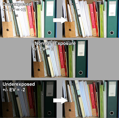 Above is a set of 3 images, exposure bracketted to +/-EV = +2, 0 and -2 respectively. I have tried to turn the over- and uderexposed into the "well exposed" image using Adobe Photoshop. The scene has around 4 zones. From my placing of the white paper as zone VI, the zones range from V to VIII. From my earlier experiments, I know that my setup (camera + monitor) has 9 useful zones. Therefore in the +2 picture, some of the highlights would be blown out becuase what was zone VIII would now be zone X, i.e. completely white. In the -2 picture, the darkest parts would lie in zone III. Theoretically, you can "rescue" a region as long as it is not completely black or white and therefore the -2 image should be easier to rescue that the +2 image which really pushes the dynamic range of the camera. This is reflected in the processed images where some areas in the overexposed image are white and lack any detail despite my efforts. Extreme pulling of these areas give only patches of grey but not detail, whereas pushing of the underexposed image yields more and more shadow detail.
Reality, on the other hand, says another story. As with film, "pushing" (lightening a dark image) gives noise and grain, the extent was and still is proportional to the ISO used and the amount of pushing. Also note that the 3 types of sensors, red, green and blue, have different sensitivities (notwithstanding the additional fact that there are twice as many green sensors on a CCD than red or blue) which means that pushed images inevitably have shifted colours which may or may not be completely correctable. Also worth noting is that pushed shots tend to be flat unless you tweak the curves to add contrast.
What is more important than the technical intracacies is the feel of the image. It is not the purpose of this blog to tell you what looks good and what doesn't; that is for you to decide. The 3 images were taken on a rainy day. I tried to be honest and preserve the feeling of overcast difused lighting in the normal exposure, in the post processed shots, the pulled shot looks like it was taken under directional lighting while the pushed shot looks more like the "normal" exposure. I could have faked directional sunlight with that shot on a rainy day if it was my purpose.
One last thing about adding digital light is to know how much digital light you can add without getting unusable grainy images with strange colour casts. This matters a lot when you are forced to underexpose, e.g. to avoid camera shake in low light conditions. Knowing for example that you can safely move zone III to zone V gives you a standard to judge how much underexposure you can use. But remember that "pushability" relates to the actual exposure time (longer digital exposures have significantly more noise while this is not as significant for film), the ISO used and perhaps most importantly, what you use to process the image and the image format. RAW files are much more tolerant to post processing. With memory devices becoming cheaper by the day, shoot RAW always.
Monday, 25 May 2009
Exposure, part IV - Examples
We are fortunate to live in an age of colour photography, where we need not rely solely on tones to convey our message. The introduction of colour has changed the subjects that could be photographed. A bland scene lacking in tones can be greatly enhanced by addition of colour.
Of course, there are ways to increase the range of tones in a flat scene like this, such as the use of a red filter, as simulated digitally below.
Being to add punch with colour doesn't mean that tones are no longer important, as illustrated in the picture below.
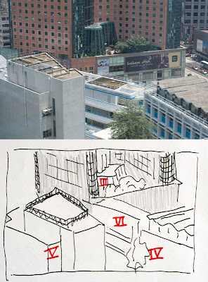 This picture was taken because, #1 it was a convenient look out of my window and #2 it was a sunny day so the scene had lots of dynamic range from the dark interior of the hotel lobby to the bright reflections on the white building. I spot metered the scene and labelled some of the larger areas. The reflections on the roof reached much higher values than zone VI and were hence impossible to preserve if the rest of the scene was to remain visible. It was decided that the areas against the sun, the brown wall of the hotel and the building on the left (which made up the majority of the picture) were to be placed in zone V, the rest of the scene fell into their respective zones as noted in the sketch. The shadowed areas were placed in zone V to ensure that the areas under direct sunlight would be in zones Vi and above to convey the snese of harsh sunlight on a cloudless summer noon.
Matrix metering suggested that I expose for an extra stop which, for me, would have blown out the lower half of the picture and destroyed the feeling of harsh directional light.


Of course, there are ways to increase the range of tones in a flat scene like this, such as the use of a red filter, as simulated digitally below.

Being to add punch with colour doesn't mean that tones are no longer important, as illustrated in the picture below.
 This picture was taken because, #1 it was a convenient look out of my window and #2 it was a sunny day so the scene had lots of dynamic range from the dark interior of the hotel lobby to the bright reflections on the white building. I spot metered the scene and labelled some of the larger areas. The reflections on the roof reached much higher values than zone VI and were hence impossible to preserve if the rest of the scene was to remain visible. It was decided that the areas against the sun, the brown wall of the hotel and the building on the left (which made up the majority of the picture) were to be placed in zone V, the rest of the scene fell into their respective zones as noted in the sketch. The shadowed areas were placed in zone V to ensure that the areas under direct sunlight would be in zones Vi and above to convey the snese of harsh sunlight on a cloudless summer noon.
Matrix metering suggested that I expose for an extra stop which, for me, would have blown out the lower half of the picture and destroyed the feeling of harsh directional light.
Thursday, 7 May 2009
Photography as an illusion.
The digital sensor and the processing software that ultimately turns millions of voltage values of the sensor into an image on the computer screen is mostly linear.
Our eyes however are not. Not only are we sensitive onto fractional changes of brightness rather than absolute values of brightness, or concept of brightness itself is highly subjective as this optical illusion will show.

The two central gray squares are, as you would know, the same shade of gray. Consider a real world example.

What is wrong with this photo? Do you see the white and black areas? I assure you neither are white or black. I manipulated it so that it only has gray tones and never reaching the full brightness [or full blackness] of my computer monitor.
The same thing happens in photos, both b&w and colour.

Doesn't the sun glow in this one? In reality, the sun in the picture is of course no brighter than the white background of this blog. If the brightness of your computer monitor is many times less than the afternoon sun, otherwise all this white background of this blog would have blinded you long before you reached this point. The same is true for the shadows. If you have ever looked at an LCD monitor at night with the lights out, you would see that the monitor glows even when you display a black square. Clearly, the blackest of blacks displayable is much brighter than what is found in the real world.
But when tones of gray come together, our brain is able to process them and generate the illusion of light. It is with this amazing shortcoming of our brains to refuse to accept any information at face value that we are able to perceive light in an image that has less than a hundredth of the dynamic range of a typical sunlit scene. The aim of a photograph is not to capture reality, through the choice of exposure, selective focus, composition and the many other tools available to the photographer, the photographer is making both necessary [due to the above mentioned constraints of the medium] and artistic interpretations of reality. A photograph is merely a two dimensional arrangement of tones that creates illusions of light, space, and for the accomplished photographer, movement and even emotion.
Why matrix metering is the worst kind of metering ever.
For me, matrix metering is a black box. Matrix metering meters the whole frame in different sections and compares it to a pre-determined set of scenes. The computer in the camera then makes it's best guess as to what is actually being photographed and adjusts the exposure accordingly.
For example, the scene has a big bright spot in the middle and everything else is dark. For the sake of discussion, let's assume that the background and the bright thing differ by 4 zones. The camera might guess that you are doing a portrait on a black background, it also assumes that a face is supposed to be in zone VI, so it returns an exposure that would put the bright area in zone VI instead of the normal zone V and gives you the exposure. All is good. The face is not gray, as it would be if you used the other "dumb" metering modes and the background is black at a nice zone II, hiding any creases and patterns that you might have in the black background cloth.
But what if I am actually photographing a lamp with a lamp shade against a wall and I would love to see the intricate pattern on the wall paper? The camera would still put the lampshade in zone VI and letting the wall fall into zone II. I would get a black wall with only minute details of the wallpaper design. Not what I wanted. It would be better to sacrifice some detail in the lampshade and get the details of the wall instead. So I would place the wall in zone IV and the lamp would fall into zone VIII. That gives me the shadow detail of the wall at the expense of loosing detail in the lamp shade.
The biggest problem of matrix metering is that you never know what zone it placed the subject in and most of the time you don't even know what part of the scene the camera thought was the subject.
I'll put this example here to get ahead of myself and bring everything together, i.e. how the inherent limitations of digital manipulation would affect exposure decisions. Consider the case where I wanted detail both in the lampshade the wall, I would instead place the wall in zone III letting the lamp shade fall into zone VII knowing that I have a better chance of getting usable detail by adding digital light to the zone III part than pulling the highlights of the zone VIII part which usually gives grays instead of the real colours of the lampshade.
Exposure, Part III - Light meters and placing the world into zones
All camera metering systems are reflective metering systems as opposed to incident metering systems, which because of their limited use, I will not talk about here in detail. I always meter with the spot meter in my camera which figures out the exposure from the amount of light in the central 5% of the frame. If your camera doesn't have such a function, you can fake it by zooming in on various parts of the image before metering. This turns your fancy matrix metering or center weighted metering into what is effectively a spot meter.
Before you do anything. Change the metering mode to spot, at least center-weighted if possible. What follows will not work with "intelligent" metering modes such as matrix metering. More on why matrix metering makes poor photos later.
First, how does the light meter determine the exposure? The meter determines the exposure necessary to render the area that is metered into a middle gray [zone V] in the final image. For digital cameras outputting JPEGs directly, one could argue that the meter knows exactly what amount of light will give a middle gray in the image because the same camera firmware that determines the exposure processes the data from the sensor into the image. If you calibrate your monitor right, it would show up as middle grey too.
Whenever you meter off some part of the scene and expose the photo according to the exposure values given by the metering system for that part of the scene, we say that you place that part of the scene in zone V. Since each photo has only one exposure , the other parts of the scene that are brighter or darker automatically fall into the other zones [yes, I do HDR too and I add digital lighting but we are talking about JPEGs straight out of the camera for now]. Without post-processing, there is nothing you can do about it, if part A and part B of the scene differ by 3 zones, they will always differ by three zones no matter what zone you place part A in.
All is nice and good if you put a card with a value of middle gray in every shot, meter from that and then remove the card to shoot the picture. This essentially turns the reflective metering system to a incident metering system because you are controlling the reflectivity of the surface on which you meter. But this is not what we usually do and most of the time, it is simply not possible. Imagine draping a large square of middle gray cloth on a distant mountain and metering off that then packing it up just before the exposure.
All still is nice and good if you photograph scenes that have elements that are middle gray or average to a middle gray [the classic example being a Dalmatian], sadly, that's often not possible either. Consider my nine shots of a white wall in part IIb. The meter reading places it in zone V so it turns out to be a perfect shade of middle gray, smack in the middle of pure white and pure black [joys of the linearity of digital images]. The meter is doing a wonderful job, but it has one critical flaw, it has no way of knowing that I want my white wall to be white. If I want the wall to be white, it had better be in zone VIII [or more], so you will have to increase the exposure by 3 stops based on the meter reading. In M mode, you would dial in your required exposure and in shutter/aperture priority modes you would set the +/-EV to +3EV to get the same results. In that way, you have just placed the wall in zone VIII.
Photos rarely have only 1 zone. Those that do are probably not very interesting either. When it comes to the real world, scenes will most often have more than 9 zones of dynamic range. Even with the much greater dynamic range of our eyes, we still cannot encompass the full range of light we encounter. The most common example is that a flash light in a dark room makes you loose you night vision, everything around the flashlight goes black, you are out of dynamic range. Our brains are hard wired to do everything to attenuate the brightest spot in the scene to our comfort level, be it grabbing sunglasses [use an ND filter when f/22 is still too bright], squinting, pupil contraction [decrease the aperture] or simply a matter of shifting perception [think of your eyes changing ISO]. Better safe than sorry. Working with the much smaller dynamic range of the camera, the photographer will need to decide what goes black and what goes white, to sacrifice some detail so as to preserve the moment. That, is the art of the exposure.
Wednesday, 6 May 2009
Exposure, Part IIb - Know your zones
Before we find out how many zones your [or rather my] camera is capable of delivering, let's go off at a tangent and look at what controls the tonal values of a photo and the concept of "stops".
For the digital photographer, there are 3 ways to change the tonal values of an image, namely shutter speed, aperture size and ISO. With that comes the concept of stops. A change in one stop is any method that will increase or decrease the amount of light getting to the sensor by a factor of two. If you change the shutter speed from 1/100 to 1/50, then the shutter is open twice as long and you have increased your exposure by one stop. Similarly if you change your aperture value from f/5.6 to f/4, you have doubled the area of the aperture [note that the aperture values form a geometric progression of sqrt 2 because they are an indication of the diameter of the aperture which is related to the area of the aperture by an exponent of 2] and hence twice as much light will pass through your lens and so you have increased your exposure by a stop. Technically, doubling the ISO value does not result in more light coming through the camera nor does it make an area twice as bright, but the ISO curves of digital camera are linear enough over the dynamic range that for our intents and purposes, I will stretch the definition a bit and claim that if you increase the ISO value by a factor of 2 the image will be twice as bright.
Now back to zones. The difference between two consecutive zones is one stop. This is how I got from pure black to pure white with my camera. The subject was a white wall with some texture. Start from zone V which is whatever the automatic metering system says is the "correct exposure", which was 1/40, f/5.6 at ISO 100 for this shot. Get the zone Iv image by exposing at one stop lower, i.e. 1/80, f/5.6 at ISO 100. The other images were generated similarly.
The single most important thing that you need to know from this article is that it does not matter what the zone V exposure is. I can generate the same set of images if I used the overcast sky as my "white wall". In that case zone V might be 1/160, f/22 at ISO 100. The I would simply get the zone IV image by changing the shutter speed to 1/320s. In an ideal world, the grey in the zone V shot of the wall would be the same grey as the zone V shot of the sky. If you already see where I am getting at, then perhaps the rest of the articles on the zone system will seem trivial. If you are still puzzled, maybe I am a bad writer or maybe you have to read on.

Theoretically, you can vary the ISO and keep the shutter speed and the aperture constant, or vary the aperture and keep the other 2 parameters constant to get this set of shots but varying the shutter speed gives you much more range because while there are a total of 6 stops of ISO and aperture [ISO100 - 3200 and f/4.0 to f/22], the shutter speed goes from 30s to 1/8000s covering almost 19 stops. Note that I could not get zones 0 and X. I and IX were pure white and pure black devoid of detail to my eyes when I look at them on my screen. Don't use the color selection tool in Photoshop to test whether your whites are actually white because what we are concerned is how the images look on your screen. It doesn't matter if the white image actually has detail, if you can't see it on your screen, it's pure white; unless of course, you look at your images by rolling a colour selection tool over it instead of looking at it.
So I find out my Canon 30D together with my crummy monitor can generate images of a dynamic range of 9 zones. Not too bad when compared to a b&w print after all [of course we are not talking about the contrast between zone I and zone IX which is much higher on a gloss print than on an LCD monitor].
Now that we know what zones are and how many zones my [and your, if you do the test] system gives me [you], we can move on to talking about how we actually use the zones.
Exposre, Part IIa - What are zones?
Richard Feynman once said,
The zone system is a means to attain an end and should, and must, be modified by each individual according to their own uses and equipment. Just Ansel would calibrate each batch of film before shooting and developing. We are fortunate that digital cameras are pretty much calibrated within each brand. Therefore I would not have to drastically change my habits when I update my camera, given that I don't switch ships.
I do not print my digital images, at least not by myself. To those who do, I congratulate you on your hard earned expertise in calibrating your printers. For me, "the print" is the image I see on my crummy laptop computer monitor and that is the end product of my photography. Of course, each of you will have a different monitor with different brightness, contrast and gamma, not to mention the nonlinearity of pixels of different colours. What is pure white on my crummy monitor may reveal some detail on your ultra high dynamic range monitors and so you will see the zones differently. What matters is that as long as I keep my monitor at its current settings, the system will work for me.
So what are zones? A zone is the vocabulary used to define a shade of black. Adams concerned himself always with the final product, the print, but the concept of zones is sometimes used to describe the density of the negative as well. Since digital photography does not produce a negative, we need not worry about that.
As with negatives, additional zones can be teased out from a digital image by special processing techniques [HDR being the most dramatic demonstration of them], but to keep it simple we shall start by looking at normally processed images. Fortunately, normal processing for digital images much more trivial than normal processing of film. For this discussion, we shall consider "normally processed" as what appears on your screen if you shoot in JPEG with the standard picture style.
"The witch doctor says he knows how to cure. There are spirits inside which are trying to get out. ... Put a snakeskin on and take quinine from the bark of a tree. The quinine works. He doesn't know he's got the wrong theory of what happens. If I'm in the tribe and I'm sick, I go to the witch doctor. He knows more about it than anyone else. But I keep trying to tell him he doesn't know what he's doing and that someday when people investigate the thing freely and get free of all his complicated ideas they'll learn much better ways of doing it."Rules such as Sunny 16 or the instinct of an experienced photographer will get them good prints, there is no doubt about that. Instinctive rules for exposure have been used since the earliest days of photography and are still used now, but the zone system of Ansel Adams allows us to talk about all the processes from exposure to the print in one coherent common language, much like how Feynman used mathematics to allow discussion of the universe we live in.
The zone system is a means to attain an end and should, and must, be modified by each individual according to their own uses and equipment. Just Ansel would calibrate each batch of film before shooting and developing. We are fortunate that digital cameras are pretty much calibrated within each brand. Therefore I would not have to drastically change my habits when I update my camera, given that I don't switch ships.
I do not print my digital images, at least not by myself. To those who do, I congratulate you on your hard earned expertise in calibrating your printers. For me, "the print" is the image I see on my crummy laptop computer monitor and that is the end product of my photography. Of course, each of you will have a different monitor with different brightness, contrast and gamma, not to mention the nonlinearity of pixels of different colours. What is pure white on my crummy monitor may reveal some detail on your ultra high dynamic range monitors and so you will see the zones differently. What matters is that as long as I keep my monitor at its current settings, the system will work for me.
So what are zones? A zone is the vocabulary used to define a shade of black. Adams concerned himself always with the final product, the print, but the concept of zones is sometimes used to describe the density of the negative as well. Since digital photography does not produce a negative, we need not worry about that.
Adams defined 11 zones for b&w prints from zone 0 to zone X covering pure white to densest black [which correspond to exposing a digital sensor indefinitely or not exposing it to any light at all]. The dynamic range or what Adams considered the "useful" range was from Zone I through Zone IX. The textural range comprising Zone II through Zone VIII was the range in which details could be discerned.
Borrowing from wikipedia, the graph below shows how Adams defined his zones.
| Zone | Description |
|---|---|
| 0 | Pure black |
| I | Near black, with slight tonality but no texture |
| II | Textured black; the darkest part of the image in which slight detail is recorded |
| III | Average dark materials and low values showing adequate texture |
| IV | Average dark foliage, dark stone, or landscape shadows |
| V | Middle gray: clear north sky; dark skin, average weathered wood |
| VI | Average Caucasian skin; light stone; shadows on snow in sunlit landscapes |
| VII | Very light skin; shadows in snow with acute side lighting |
| VIII | Lightest tone with texture: textured snow |
| IX | Slight tone without texture; glaring snow |
| X | Pure white: light sources and specular reflections |
As with negatives, additional zones can be teased out from a digital image by special processing techniques [HDR being the most dramatic demonstration of them], but to keep it simple we shall start by looking at normally processed images. Fortunately, normal processing for digital images much more trivial than normal processing of film. For this discussion, we shall consider "normally processed" as what appears on your screen if you shoot in JPEG with the standard picture style.
Essentials of the exposure, Part I - Introduction
For lack of a comprehensive guide to exposing a photograph, except perhaps Ansel Adams famous trilogy, this blog is born. I will try to assemble here, from my own experience and materials gathered from others, a step by step guide to the zone system that will be comprehensible and useful to both the masters and the inexperienced. A bold challenge indeed.
In this age where every camera has AE, one might ask, "why start from exposure not composition?" This is the question I have asked myself too. It is perhaps easier to assemble a guide to composition rules but in the end, composition is more of an art than exposure is. Although the novice will undoubtedly be bored by lengthy (I assure you that there will be many parts on this) and somewhat technical discussions on exposure, I feel that in the end, exposure will be easier to master than composition.
One of the most vigourous treatments of exposure was provided by the master photographer, Ansel Adams, in the form of the zone system. The zone system was a system which enabled the photographer to determine all the necessary steps in order to create his/her desired print. Emphasis was that all the steps from exposure, development and printing were of equal importance to the final product, the print. Too often, digital photographers fail to realise this relying too heavily on post processing to achieve the desired print. Make no mistake, Ansel believed that each print should be processed differently. He would be an advocate of digital manipulation if he were born in our age but the fact is that digital or darkroom manipulation will never fully correct for mistakes made during the exposure.
The subsequent articles will discuss the exposure part of the zone system in the context of digital colour photos. While b&w images illustrate the concept of zones and tones better, most b&w photos straight out of the camera are rather unattractive and require post processing which complicates our discussion of exposure. (Even from this early stage, it becomes evident that exposure and post processing are intertwined.) Given that we do not operate digital cameras in fully manual mode all the time, the discussion of exposure will use terms such as exposure compensation, but keep in mind that +1EV is moving the exposure 1 zone up from what the meter suggests [zone V] and the -EVs are the opposite.
Ansel said in 1981, that
“I believe the electronic image will be the next major advance. Such systems will have their own inherent and inescapable structural characteristics, and the artist and functional practitioner will again strive to comprehend and control them.”And it is with this in mind that we will explore the "inherent and inescapable structural characteristics" of the digital image in the articles to come.
Subscribe to:
Posts (Atom)