I am obviously not the most eloquent person when it comes to explaining advanced theories of lens design. Therefore, here are a few links to some of the cyberspace gurus.
Paul van Walree. All about aberations and causes of optical flaws: http://toothwalker.org/optics.html
Erwin Puts. Lots of information on lens design and how to read MTF charts: http://www.imx.nl/photo/index.html
Monday, 13 July 2009

Saturday, 4 July 2009
Colour Balance
I have been told not to meddle with the creative process. That is why I have steered clear of the topic of composition till now, but there is one topic that I believe requires special attention, and it is the topic of this post, colour balance. There are no rules in art. If you worry that looking at this post will limit your creativity, skip it now.
Colour balnce is simply how most people think colours go together. That is probably why the rules of colour balance are often obeyed in flags. After all, you do want your flag to be pleasing to the eye, right? Most people have an idea of which colours to include in a picture, e.g. the use of contrasting colours, etc. The concept of colour balance is how much of each colour should be present. Consider the red-yellow-blue colour wheel, the general rule is that adjacent primary colours (red-yellow, yellow-blue, blue-red) balance each other in 1:1 or 1:3.

 Colours opposite each other (red-green, yellow-purple, blue-orange) balance in bits, i.e. less than 1:3.

 This is only a general rule and many other pleasing combinations exist. Furthermore, the balance changes as the tones change, i.e. pleasing proportions of red to green might not be pleasing for pink and olive. Treat this as a starting point for arranging colours in your art if you find yourself out of inspiration, but always endeavour to find something new and exciting. Remember, your eye is the final judge.
Colour balnce is simply how most people think colours go together. That is probably why the rules of colour balance are often obeyed in flags. After all, you do want your flag to be pleasing to the eye, right? Most people have an idea of which colours to include in a picture, e.g. the use of contrasting colours, etc. The concept of colour balance is how much of each colour should be present. Consider the red-yellow-blue colour wheel, the general rule is that adjacent primary colours (red-yellow, yellow-blue, blue-red) balance each other in 1:1 or 1:3.

 Colours opposite each other (red-green, yellow-purple, blue-orange) balance in bits, i.e. less than 1:3.
 This is only a general rule and many other pleasing combinations exist. Furthermore, the balance changes as the tones change, i.e. pleasing proportions of red to green might not be pleasing for pink and olive. Treat this as a starting point for arranging colours in your art if you find yourself out of inspiration, but always endeavour to find something new and exciting. Remember, your eye is the final judge.
Thursday, 11 June 2009
Bokeh and DOF, part 1
Background blur, out of focus areas, lens blur, bokeh, whatever you choose to call it. It's the areas in the photo that are not in the plane of sharp focus. Because most of our pictures are of three dimensional objects, bokeh exists in every picture. Background blur helps convey a sense of three dimensionality from a flat picture. Sometimes it is nice to blur out distracting backgrounds, this technique is especially common for portrait shots.
So how does bokeh occur and what governs the blurriness of the bokeh? What is good/bad bokeh? For that, it's time to review your high school optics.
WARNING: Lots of ray diagrams ahead. Skip to "Bluriness and Depth of Field" if needed.
 Whenever the film/sensor is not at the point of sharp focus, the rays that reach the film exist as a patch in the shape of the aperture (triangular in this diagram, hexagonal or round for most lenses) and it is these patches of light that make up the bokeh. Convince yourself that the larger the patch of light, the more defocused the image is. Once you've done that, it's time to talk about the 3 factors that affect the bluriness of bokeh, i.e. focal length, aperture and subject-background distance.
Effect of Focal length
The longer the focal length, the more blurry out-of-focus (OOF) objects become (given that the other two factors are kept the same).
 Here we have two lenses, one of focal length 30mm and the other 80mm. The 80mm lens has more background blur than the 30mm lens. If we treat the red object (object giving out red rays) as the subject of interest, we would move the lens to place the image of the red object at the film plane. The bokeh of the green object is given by the unfocused green light that reaches the film plane (where the image of the red object is). It is seen that d2 is larger than d1. In other words, the unfocused light from the green object is more unfocused when it gets to the film plane. So the image of the green object is blurier when the 80mm lens is used.
Effect of Aperture
The larger the aperture, the more OOF objects become.
 Using our hypothetical 80mm lens, we take a photo at full aperture, again focused at the red object. The spread of the green rays is then d3. If we stop down, the light that reaches the lens becomes "straighter" (closer to the centre). The effect is that the spread of the exiting rays is decreased (d4 Vs d3) and the green object appears less blurry. Taken to an extreme case, if we do away with the lens and use a pinhole, then everything would be equally sharp in the picture regardless of object distance.
Effects of Object Distance
This is perhaps the most puzzling part of OOF objects. Intuitive enough is the fact that the greater the seperation between the object and the background the more blurry the background. What is puzzling is that given the same distance between the subject and the background, the background is more blurred if the subject is closer to the lens. Given 3 objects (red, green and blue) equidistant from each other, their images after passing through our hypothetical 80mm lens are as shown above.
The first point that the further away the object the more blurred it becomes can be seen by comparing the spread of the green and blue rays at the plane of the red image. The spread of the further away object (blue) is much greater than the closer object (green). Intuitive. The further away from the point that the lens is focused at (i.e. the red object), the more defocused you are.
The second part that even if the objects are separated equally, the closer pair will yield a more blurred background can be illustrated by comparing d1 and d2. If we focus the lens on the green object, the spread of the blue rays in the image is d1. When we focus on the red object instead, the spread of the green rays is d2 which is larger than d1. This means that although the distance between red and green and green and blue are the same, because red and green are closer to the lens, green is more blurred. If we think of it in another way, this too becomes intuitive. Consider two people one 3m in front of the other. If you were 1 meter away, they would be 1 and 4m away from you, a 400% difference. If you were 1km away, they would be 1000 and 1004m away, which is just a 0.4% difference. Now it is intuitive that two objects differing by 0.4% yield similar images while objects differing by 400% should give vastly different images.
Bluriness and Depth of Field
In an ideal world with film of infinite resolution where we can view images with infinite magnification, the plane of sharp focus has no thickness and only objects at a specific distance, e.g. 3m and not 3.0000001m, will be in focus. In this world however, we do not view images with infinite magnificantion, even if we did, we would hit the resolution limit of the film/sensor where slightly out of focus and sharply focused images cannot be distinguished. Depth of field (DOF) is simply how much bluriness can "fly under the radar". If we cannot percieve it as blurred, it is sharp.
A large DOF means that the transition from sharp to perceptible bluriness is over a large object distance. Most, if not all, parts of the image are perceived as sharp. A shallow DOF is the opposite, the transition from sharp to blurred occurs over a short distance, only objects close to the plane of sharp focus are perceived as sharp.
The trick to shallow DOF? Use a long lens, use a larger aperture, get close to the subject and choose a background that is far away.
So how does bokeh occur and what governs the blurriness of the bokeh? What is good/bad bokeh? For that, it's time to review your high school optics.
WARNING: Lots of ray diagrams ahead. Skip to "Bluriness and Depth of Field" if needed.
 Whenever the film/sensor is not at the point of sharp focus, the rays that reach the film exist as a patch in the shape of the aperture (triangular in this diagram, hexagonal or round for most lenses) and it is these patches of light that make up the bokeh. Convince yourself that the larger the patch of light, the more defocused the image is. Once you've done that, it's time to talk about the 3 factors that affect the bluriness of bokeh, i.e. focal length, aperture and subject-background distance.
Effect of Focal length
The longer the focal length, the more blurry out-of-focus (OOF) objects become (given that the other two factors are kept the same).
 Here we have two lenses, one of focal length 30mm and the other 80mm. The 80mm lens has more background blur than the 30mm lens. If we treat the red object (object giving out red rays) as the subject of interest, we would move the lens to place the image of the red object at the film plane. The bokeh of the green object is given by the unfocused green light that reaches the film plane (where the image of the red object is). It is seen that d2 is larger than d1. In other words, the unfocused light from the green object is more unfocused when it gets to the film plane. So the image of the green object is blurier when the 80mm lens is used.
Effect of Aperture
The larger the aperture, the more OOF objects become.
 Using our hypothetical 80mm lens, we take a photo at full aperture, again focused at the red object. The spread of the green rays is then d3. If we stop down, the light that reaches the lens becomes "straighter" (closer to the centre). The effect is that the spread of the exiting rays is decreased (d4 Vs d3) and the green object appears less blurry. Taken to an extreme case, if we do away with the lens and use a pinhole, then everything would be equally sharp in the picture regardless of object distance.
Effects of Object Distance
This is perhaps the most puzzling part of OOF objects. Intuitive enough is the fact that the greater the seperation between the object and the background the more blurry the background. What is puzzling is that given the same distance between the subject and the background, the background is more blurred if the subject is closer to the lens.
 Given 3 objects (red, green and blue) equidistant from each other, their images after passing through our hypothetical 80mm lens are as shown above.
The first point that the further away the object the more blurred it becomes can be seen by comparing the spread of the green and blue rays at the plane of the red image. The spread of the further away object (blue) is much greater than the closer object (green). Intuitive. The further away from the point that the lens is focused at (i.e. the red object), the more defocused you are.
The second part that even if the objects are separated equally, the closer pair will yield a more blurred background can be illustrated by comparing d1 and d2. If we focus the lens on the green object, the spread of the blue rays in the image is d1. When we focus on the red object instead, the spread of the green rays is d2 which is larger than d1. This means that although the distance between red and green and green and blue are the same, because red and green are closer to the lens, green is more blurred. If we think of it in another way, this too becomes intuitive. Consider two people one 3m in front of the other. If you were 1 meter away, they would be 1 and 4m away from you, a 400% difference. If you were 1km away, they would be 1000 and 1004m away, which is just a 0.4% difference. Now it is intuitive that two objects differing by 0.4% yield similar images while objects differing by 400% should give vastly different images.
Bluriness and Depth of Field
In an ideal world with film of infinite resolution where we can view images with infinite magnification, the plane of sharp focus has no thickness and only objects at a specific distance, e.g. 3m and not 3.0000001m, will be in focus. In this world however, we do not view images with infinite magnificantion, even if we did, we would hit the resolution limit of the film/sensor where slightly out of focus and sharply focused images cannot be distinguished. Depth of field (DOF) is simply how much bluriness can "fly under the radar". If we cannot percieve it as blurred, it is sharp.
A large DOF means that the transition from sharp to perceptible bluriness is over a large object distance. Most, if not all, parts of the image are perceived as sharp. A shallow DOF is the opposite, the transition from sharp to blurred occurs over a short distance, only objects close to the plane of sharp focus are perceived as sharp.
The trick to shallow DOF? Use a long lens, use a larger aperture, get close to the subject and choose a background that is far away.
Digital Processing
Finally we come to the part where purists will cringe at, digital post processing. In fact, such cringing is unrooted. We have been tweaking our film in the darkroom for as long as film has been around. We know that time, temperature, developer, dilution and agitation all affect the response curve of the negative; colour negatives are colour balanced during printing; and we have even applied more aggressive techniques such as dodging and burning or spilt contrast printing without feeling that we manipulated the negative. I think I have made my case.
Before this we have been dealing with image files coming directly from the camera, converted to JPEGs by the camera firmware and displayed on your computer monitor without user intervention. Somewhat akin to shooting slide film, where you have control only on the exposure but not the processing. Not being an expert of the digital darkroom, I shall only briefly talk about what I see as limitations of digital manipulation.
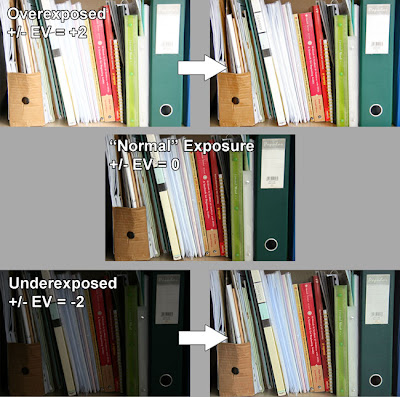 Above is a set of 3 images, exposure bracketted to +/-EV = +2, 0 and -2 respectively. I have tried to turn the over- and uderexposed into the "well exposed" image using Adobe Photoshop. The scene has around 4 zones. From my placing of the white paper as zone VI, the zones range from V to VIII. From my earlier experiments, I know that my setup (camera + monitor) has 9 useful zones. Therefore in the +2 picture, some of the highlights would be blown out becuase what was zone VIII would now be zone X, i.e. completely white. In the -2 picture, the darkest parts would lie in zone III. Theoretically, you can "rescue" a region as long as it is not completely black or white and therefore the -2 image should be easier to rescue that the +2 image which really pushes the dynamic range of the camera. This is reflected in the processed images where some areas in the overexposed image are white and lack any detail despite my efforts. Extreme pulling of these areas give only patches of grey but not detail, whereas pushing of the underexposed image yields more and more shadow detail.
Reality, on the other hand, says another story. As with film, "pushing" (lightening a dark image) gives noise and grain, the extent was and still is proportional to the ISO used and the amount of pushing. Also note that the 3 types of sensors, red, green and blue, have different sensitivities (notwithstanding the additional fact that there are twice as many green sensors on a CCD than red or blue) which means that pushed images inevitably have shifted colours which may or may not be completely correctable. Also worth noting is that pushed shots tend to be flat unless you tweak the curves to add contrast.
What is more important than the technical intracacies is the feel of the image. It is not the purpose of this blog to tell you what looks good and what doesn't; that is for you to decide. The 3 images were taken on a rainy day. I tried to be honest and preserve the feeling of overcast difused lighting in the normal exposure, in the post processed shots, the pulled shot looks like it was taken under directional lighting while the pushed shot looks more like the "normal" exposure. I could have faked directional sunlight with that shot on a rainy day if it was my purpose.
One last thing about adding digital light is to know how much digital light you can add without getting unusable grainy images with strange colour casts. This matters a lot when you are forced to underexpose, e.g. to avoid camera shake in low light conditions. Knowing for example that you can safely move zone III to zone V gives you a standard to judge how much underexposure you can use. But remember that "pushability" relates to the actual exposure time (longer digital exposures have significantly more noise while this is not as significant for film), the ISO used and perhaps most importantly, what you use to process the image and the image format. RAW files are much more tolerant to post processing. With memory devices becoming cheaper by the day, shoot RAW always.
Before this we have been dealing with image files coming directly from the camera, converted to JPEGs by the camera firmware and displayed on your computer monitor without user intervention. Somewhat akin to shooting slide film, where you have control only on the exposure but not the processing. Not being an expert of the digital darkroom, I shall only briefly talk about what I see as limitations of digital manipulation.
 Above is a set of 3 images, exposure bracketted to +/-EV = +2, 0 and -2 respectively. I have tried to turn the over- and uderexposed into the "well exposed" image using Adobe Photoshop. The scene has around 4 zones. From my placing of the white paper as zone VI, the zones range from V to VIII. From my earlier experiments, I know that my setup (camera + monitor) has 9 useful zones. Therefore in the +2 picture, some of the highlights would be blown out becuase what was zone VIII would now be zone X, i.e. completely white. In the -2 picture, the darkest parts would lie in zone III. Theoretically, you can "rescue" a region as long as it is not completely black or white and therefore the -2 image should be easier to rescue that the +2 image which really pushes the dynamic range of the camera. This is reflected in the processed images where some areas in the overexposed image are white and lack any detail despite my efforts. Extreme pulling of these areas give only patches of grey but not detail, whereas pushing of the underexposed image yields more and more shadow detail.
Reality, on the other hand, says another story. As with film, "pushing" (lightening a dark image) gives noise and grain, the extent was and still is proportional to the ISO used and the amount of pushing. Also note that the 3 types of sensors, red, green and blue, have different sensitivities (notwithstanding the additional fact that there are twice as many green sensors on a CCD than red or blue) which means that pushed images inevitably have shifted colours which may or may not be completely correctable. Also worth noting is that pushed shots tend to be flat unless you tweak the curves to add contrast.
What is more important than the technical intracacies is the feel of the image. It is not the purpose of this blog to tell you what looks good and what doesn't; that is for you to decide. The 3 images were taken on a rainy day. I tried to be honest and preserve the feeling of overcast difused lighting in the normal exposure, in the post processed shots, the pulled shot looks like it was taken under directional lighting while the pushed shot looks more like the "normal" exposure. I could have faked directional sunlight with that shot on a rainy day if it was my purpose.
One last thing about adding digital light is to know how much digital light you can add without getting unusable grainy images with strange colour casts. This matters a lot when you are forced to underexpose, e.g. to avoid camera shake in low light conditions. Knowing for example that you can safely move zone III to zone V gives you a standard to judge how much underexposure you can use. But remember that "pushability" relates to the actual exposure time (longer digital exposures have significantly more noise while this is not as significant for film), the ISO used and perhaps most importantly, what you use to process the image and the image format. RAW files are much more tolerant to post processing. With memory devices becoming cheaper by the day, shoot RAW always.
Monday, 25 May 2009
Exposure, part IV - Examples
We are fortunate to live in an age of colour photography, where we need not rely solely on tones to convey our message. The introduction of colour has changed the subjects that could be photographed. A bland scene lacking in tones can be greatly enhanced by addition of colour.
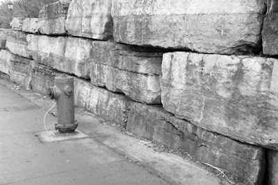
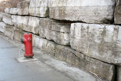
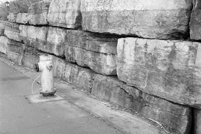
Of course, there are ways to increase the range of tones in a flat scene like this, such as the use of a red filter, as simulated digitally below.
Being to add punch with colour doesn't mean that tones are no longer important, as illustrated in the picture below.
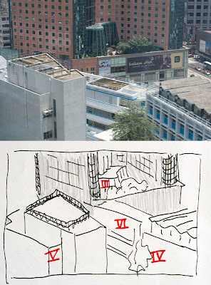 This picture was taken because, #1 it was a convenient look out of my window and #2 it was a sunny day so the scene had lots of dynamic range from the dark interior of the hotel lobby to the bright reflections on the white building. I spot metered the scene and labelled some of the larger areas. The reflections on the roof reached much higher values than zone VI and were hence impossible to preserve if the rest of the scene was to remain visible. It was decided that the areas against the sun, the brown wall of the hotel and the building on the left (which made up the majority of the picture) were to be placed in zone V, the rest of the scene fell into their respective zones as noted in the sketch. The shadowed areas were placed in zone V to ensure that the areas under direct sunlight would be in zones Vi and above to convey the snese of harsh sunlight on a cloudless summer noon.
Matrix metering suggested that I expose for an extra stop which, for me, would have blown out the lower half of the picture and destroyed the feeling of harsh directional light.


Of course, there are ways to increase the range of tones in a flat scene like this, such as the use of a red filter, as simulated digitally below.

Being to add punch with colour doesn't mean that tones are no longer important, as illustrated in the picture below.
 This picture was taken because, #1 it was a convenient look out of my window and #2 it was a sunny day so the scene had lots of dynamic range from the dark interior of the hotel lobby to the bright reflections on the white building. I spot metered the scene and labelled some of the larger areas. The reflections on the roof reached much higher values than zone VI and were hence impossible to preserve if the rest of the scene was to remain visible. It was decided that the areas against the sun, the brown wall of the hotel and the building on the left (which made up the majority of the picture) were to be placed in zone V, the rest of the scene fell into their respective zones as noted in the sketch. The shadowed areas were placed in zone V to ensure that the areas under direct sunlight would be in zones Vi and above to convey the snese of harsh sunlight on a cloudless summer noon.
Matrix metering suggested that I expose for an extra stop which, for me, would have blown out the lower half of the picture and destroyed the feeling of harsh directional light.
Thursday, 7 May 2009
Photography as an illusion.
The digital sensor and the processing software that ultimately turns millions of voltage values of the sensor into an image on the computer screen is mostly linear.
Our eyes however are not. Not only are we sensitive onto fractional changes of brightness rather than absolute values of brightness, or concept of brightness itself is highly subjective as this optical illusion will show.

The two central gray squares are, as you would know, the same shade of gray. Consider a real world example.

What is wrong with this photo? Do you see the white and black areas? I assure you neither are white or black. I manipulated it so that it only has gray tones and never reaching the full brightness [or full blackness] of my computer monitor.
The same thing happens in photos, both b&w and colour.

Doesn't the sun glow in this one? In reality, the sun in the picture is of course no brighter than the white background of this blog. If the brightness of your computer monitor is many times less than the afternoon sun, otherwise all this white background of this blog would have blinded you long before you reached this point. The same is true for the shadows. If you have ever looked at an LCD monitor at night with the lights out, you would see that the monitor glows even when you display a black square. Clearly, the blackest of blacks displayable is much brighter than what is found in the real world.
But when tones of gray come together, our brain is able to process them and generate the illusion of light. It is with this amazing shortcoming of our brains to refuse to accept any information at face value that we are able to perceive light in an image that has less than a hundredth of the dynamic range of a typical sunlit scene. The aim of a photograph is not to capture reality, through the choice of exposure, selective focus, composition and the many other tools available to the photographer, the photographer is making both necessary [due to the above mentioned constraints of the medium] and artistic interpretations of reality. A photograph is merely a two dimensional arrangement of tones that creates illusions of light, space, and for the accomplished photographer, movement and even emotion.
Our eyes however are not. Not only are we sensitive onto fractional changes of brightness rather than absolute values of brightness, or concept of brightness itself is highly subjective as this optical illusion will show.

The two central gray squares are, as you would know, the same shade of gray. Consider a real world example.

What is wrong with this photo? Do you see the white and black areas? I assure you neither are white or black. I manipulated it so that it only has gray tones and never reaching the full brightness [or full blackness] of my computer monitor.
The same thing happens in photos, both b&w and colour.

Doesn't the sun glow in this one? In reality, the sun in the picture is of course no brighter than the white background of this blog. If the brightness of your computer monitor is many times less than the afternoon sun, otherwise all this white background of this blog would have blinded you long before you reached this point. The same is true for the shadows. If you have ever looked at an LCD monitor at night with the lights out, you would see that the monitor glows even when you display a black square. Clearly, the blackest of blacks displayable is much brighter than what is found in the real world.
But when tones of gray come together, our brain is able to process them and generate the illusion of light. It is with this amazing shortcoming of our brains to refuse to accept any information at face value that we are able to perceive light in an image that has less than a hundredth of the dynamic range of a typical sunlit scene. The aim of a photograph is not to capture reality, through the choice of exposure, selective focus, composition and the many other tools available to the photographer, the photographer is making both necessary [due to the above mentioned constraints of the medium] and artistic interpretations of reality. A photograph is merely a two dimensional arrangement of tones that creates illusions of light, space, and for the accomplished photographer, movement and even emotion.
Why matrix metering is the worst kind of metering ever.
For me, matrix metering is a black box. Matrix metering meters the whole frame in different sections and compares it to a pre-determined set of scenes. The computer in the camera then makes it's best guess as to what is actually being photographed and adjusts the exposure accordingly.
For example, the scene has a big bright spot in the middle and everything else is dark. For the sake of discussion, let's assume that the background and the bright thing differ by 4 zones. The camera might guess that you are doing a portrait on a black background, it also assumes that a face is supposed to be in zone VI, so it returns an exposure that would put the bright area in zone VI instead of the normal zone V and gives you the exposure. All is good. The face is not gray, as it would be if you used the other "dumb" metering modes and the background is black at a nice zone II, hiding any creases and patterns that you might have in the black background cloth.
But what if I am actually photographing a lamp with a lamp shade against a wall and I would love to see the intricate pattern on the wall paper? The camera would still put the lampshade in zone VI and letting the wall fall into zone II. I would get a black wall with only minute details of the wallpaper design. Not what I wanted. It would be better to sacrifice some detail in the lampshade and get the details of the wall instead. So I would place the wall in zone IV and the lamp would fall into zone VIII. That gives me the shadow detail of the wall at the expense of loosing detail in the lamp shade.
The biggest problem of matrix metering is that you never know what zone it placed the subject in and most of the time you don't even know what part of the scene the camera thought was the subject.
I'll put this example here to get ahead of myself and bring everything together, i.e. how the inherent limitations of digital manipulation would affect exposure decisions. Consider the case where I wanted detail both in the lampshade the wall, I would instead place the wall in zone III letting the lamp shade fall into zone VII knowing that I have a better chance of getting usable detail by adding digital light to the zone III part than pulling the highlights of the zone VIII part which usually gives grays instead of the real colours of the lampshade.
For example, the scene has a big bright spot in the middle and everything else is dark. For the sake of discussion, let's assume that the background and the bright thing differ by 4 zones. The camera might guess that you are doing a portrait on a black background, it also assumes that a face is supposed to be in zone VI, so it returns an exposure that would put the bright area in zone VI instead of the normal zone V and gives you the exposure. All is good. The face is not gray, as it would be if you used the other "dumb" metering modes and the background is black at a nice zone II, hiding any creases and patterns that you might have in the black background cloth.
But what if I am actually photographing a lamp with a lamp shade against a wall and I would love to see the intricate pattern on the wall paper? The camera would still put the lampshade in zone VI and letting the wall fall into zone II. I would get a black wall with only minute details of the wallpaper design. Not what I wanted. It would be better to sacrifice some detail in the lampshade and get the details of the wall instead. So I would place the wall in zone IV and the lamp would fall into zone VIII. That gives me the shadow detail of the wall at the expense of loosing detail in the lamp shade.
The biggest problem of matrix metering is that you never know what zone it placed the subject in and most of the time you don't even know what part of the scene the camera thought was the subject.
I'll put this example here to get ahead of myself and bring everything together, i.e. how the inherent limitations of digital manipulation would affect exposure decisions. Consider the case where I wanted detail both in the lampshade the wall, I would instead place the wall in zone III letting the lamp shade fall into zone VII knowing that I have a better chance of getting usable detail by adding digital light to the zone III part than pulling the highlights of the zone VIII part which usually gives grays instead of the real colours of the lampshade.
Subscribe to:
Posts (Atom)